Why I Chose a Single-Column Layout for DevSac (and What It Cost Me)
DevSac is a single-column site. One column, top to bottom, on every page. I made that decision early and it shaped everything that followed. The homepage, the project showcases, the blog you are reading right now. All single column.
That choice cost me visual variety. Visitors scroll more. The above-the-fold real estate is limited to one idea at a time. But it also gave me something more valuable: every piece of content gets full attention, the site works identically on mobile and desktop, and I spent zero time debugging column collapse behavior across breakpoints.

The Layouts That Actually Matter
Design textbooks will teach you F-patterns, Z-patterns, holy grail layouts, sidebar variations. Most of that is academic. In practice, I reach for three patterns and they cover every project I have built.
Single Column (DevSac, This Blog)
Single column is the default for content that needs to be read. Blog posts, portfolios, landing pages. The entire reading experience is linear: top to bottom, one idea after another. There is nothing competing for attention in the periphery.
DevSac’s homepage uses a single column with full-width sections that alternate between text, project showcases, and calls to action. Each section gets the full viewport width. On a 1440px monitor, the content area maxes out at about 65 characters per line, which is the sweet spot for reading comfort.
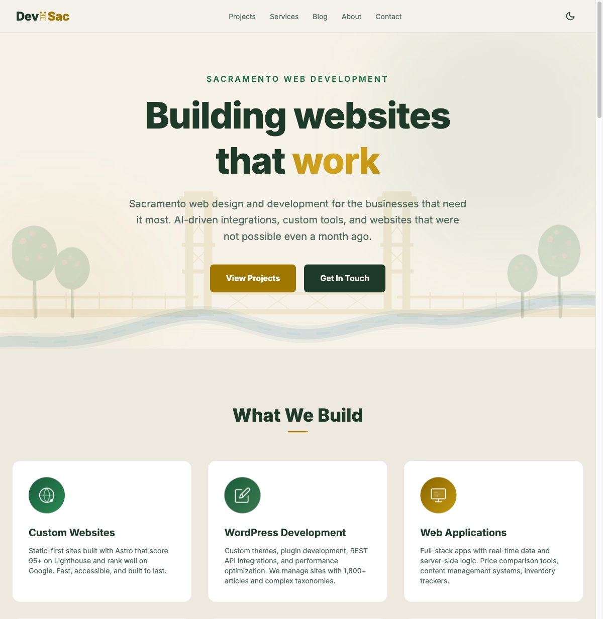
The tradeoff is density. You cannot show six things at once. Every piece of content takes vertical space, which means more scrolling. For a portfolio site where I want people to focus on one project at a time, that is the right tradeoff.
Card Grid (Van Briggle Pottery)
When I built the Van Briggle e-commerce site, single column was wrong. A pottery catalog has dozens of products. Visitors want to browse, compare, and scan. They need to see multiple options at a glance.
Cards solved that. Each product gets a self-contained block: image, name, glaze, price. The grid shows three columns on desktop, two on tablet, one on mobile. In Tailwind, that is grid grid-cols-1 md:grid-cols-2 lg:grid-cols-3 and the responsive behavior is automatic.
Card grids work when the content is uniform. Products, team members, blog post listings, project portfolios. Every card has roughly the same structure and importance. The moment one card needs to be more prominent than others, the grid starts fighting you.
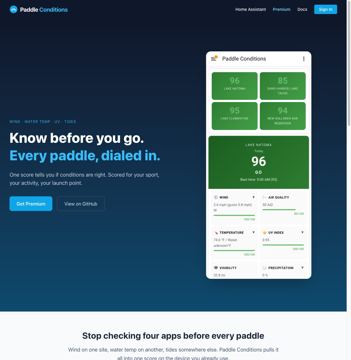
Split Hero (PaddleConditions)
PaddleConditions is a data dashboard. The layout needs to show current conditions (water temperature, flow rate, wind) alongside a map and forecast. That is inherently two-dimensional information. A single column would force users to scroll back and forth between the data they are comparing.
The split layout puts the current conditions panel on one side and the map on the other. Below that, the forecast data flows into a card grid. It is the most complex layout I maintain, and it is the only project where that complexity is justified by the content.
What I Got Wrong
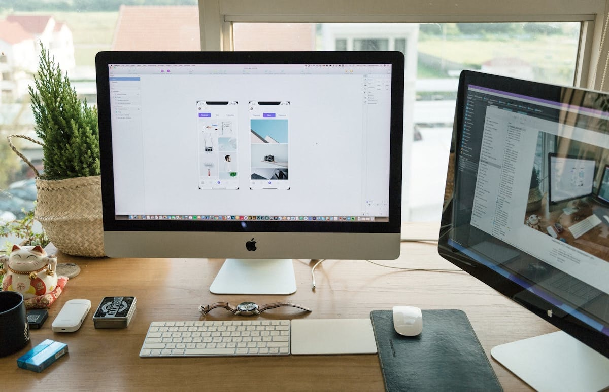
Early versions of DevSac had a two-column project showcase. Left column: project description and tech stack. Right column: screenshot. It looked great on my 27-inch monitor. Clean, balanced, professional.
On a 13-inch laptop, it was cramped. On a tablet, the text column was too narrow to read comfortably. On mobile, the columns stacked, but the screenshot ended up above the description, which made no sense. Visitors saw an image with no context.
I rebuilt it as a single-column layout with the screenshot spanning full width above the description. Simpler. More readable at every size. The lesson was obvious in hindsight: I was designing for my screen, not for the screens my visitors actually use.
Mobile Kills Most Layout Decisions
Over 60% of web traffic is mobile. For local Sacramento businesses, that number is often higher because people search on their phones while they are out. I wrote about this pattern in my Sacramento small business website guide.
Here is what that means for layout: most multi-column desktop layouts collapse to single column on mobile. Your three-column grid becomes one column. Your sidebar disappears or stacks below the content. Your split hero becomes a vertical stack.
If the layout is going to be single column on 60%+ of devices, start there. Design the mobile layout first, then decide if the desktop version genuinely benefits from additional columns. Sometimes it does (product catalogs, dashboards). Often it does not (landing pages, blogs, portfolios).
This is not a philosophical stance. It is a time calculation. Every additional column means additional responsive testing, additional edge cases where content wraps awkwardly, additional maintenance when you update the site. If single column works for the content, use it and spend the saved time on things that actually move the needle. This is the kind of practical web design thinking that separates sites built for real users from sites built for design awards.
Common Mistakes I See on Sacramento Business Sites
I review a lot of local business sites. These are the layout problems that come up repeatedly.
Three columns crammed onto mobile. A Sacramento restaurant site I looked at recently had a three-column layout for their menu: appetizers, entrees, desserts side by side. On desktop, fine. On a phone, three columns of 8pt text. Nobody is reading that. The fix is simple: stack the columns vertically on mobile. One column, readable type, done.
Auto-playing carousels eating the entire viewport. The hero section is your most valuable real estate. Filling it with a rotating slideshow means visitors see a random slide for 2 seconds before it changes. Studies from the Nielsen Norman Group show that auto-advancing carousels have abysmal click-through rates. Put your strongest message in a static hero instead.
Tiny tap targets. Mobile users are tapping with fingers, not clicking with a mouse cursor. Google recommends tap targets of at least 48x48 pixels with 8 pixels of spacing between them. I regularly see Sacramento business sites with navigation links stacked 12 pixels apart. That is a usability failure and an accessibility violation.
Sidebar overload. Sidebars made sense when desktop was king. Now they are a liability. Every sidebar widget (recent posts, categories, tag clouds, social feeds) is content competing with your main message. If you are deciding whether to rebuild your site, killing the sidebar is one of the highest-impact changes you can make.
No visual hierarchy. When everything is the same size, weight, and color, nothing stands out. The homepage becomes a wall of text. I see this most often on sites built from generic templates. The template provides structure but no guidance on what content should be emphasized. A layout designed around your actual content will always outperform a template you filled in.
Get a Layout That Works
If your site’s layout is fighting your content instead of supporting it, that is a solvable problem. Look at the projects page to see how I approach layout differently for each type of site. Then reach out and tell me what is not working. I will tell you what I would change and why.