Website Design Trends for Small Business in 2026
Every year brings a new list of website design trends. Glassmorphism. Neubrutalism. Kinetic typography. Bento grids. Most of these trends look great in design portfolios and perform terribly for small businesses.
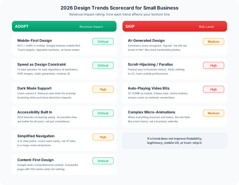
The design trends that matter for small businesses are the ones that affect revenue: loading speed, mobile usability, conversion flow, and trust signals. Here is what actually matters in 2026 and what you can safely ignore.
Trends That Drive Revenue
Mobile-First Is No Longer Optional
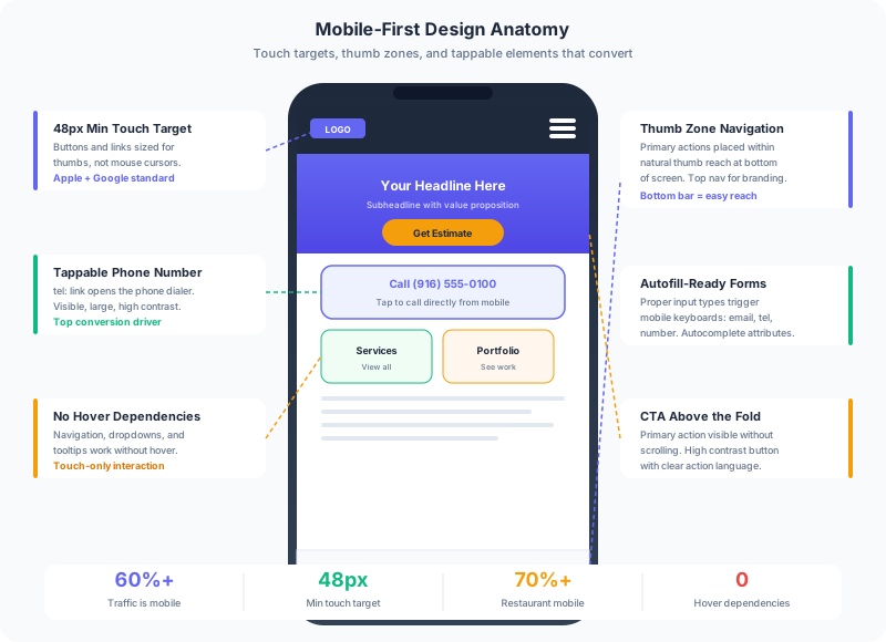
This is not new, but the data keeps getting more extreme. Over 60% of website traffic across every industry comes from mobile devices. For restaurants it is 70%+. For local services it is 65%+. Google indexes the mobile version of your site first, which means your mobile experience is your primary experience.
In 2026, mobile-first means more than responsive layout. It means designing the mobile experience first and letting desktop inherit it, not the other way around. Touch targets sized for thumbs (48px minimum). Forms that work with autofill. Phone numbers that are tappable. Navigation that works without hover states.
Speed as a Design Decision
Core Web Vitals are a ranking factor. A site that loads in 1 second outranks and outconverts a site that loads in 4 seconds, regardless of how beautiful the 4-second site is. Performance is not an engineering concern. It is a design constraint.
This means: no hero video backgrounds that load 10MB on mobile. No JavaScript-heavy animations that block rendering. No image carousels with 8 uncompressed slides. Every design element should justify its weight in bytes.
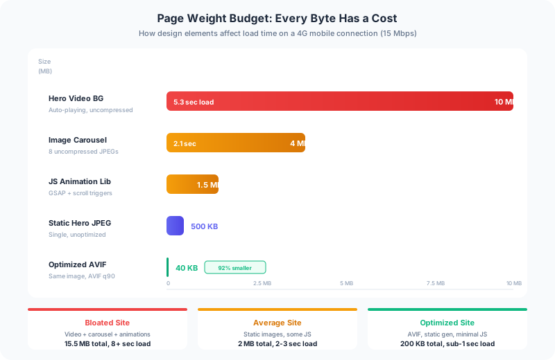
The sites built through Frog Stone Media web design services use static generation through Astro, AVIF images (40-60% smaller than JPEG at the same quality), and minimal JavaScript. The result is sub-second load times on mobile connections. That is not a technical achievement. It is a design decision that prioritizes the user over the portfolio screenshot.
Dark Mode as Standard
Dark mode went from a novelty to an expectation. Every major operating system, browser, and app supports it. Users who enable dark mode on their phone expect websites to respect that preference.
Implementing dark mode correctly is harder than adding @media (prefers-color-scheme: dark) to your CSS. Color contrast ratios change. Images need to work on both light and dark backgrounds. Animations that use hardcoded background colors break in dark mode. But the payoff is real: dark mode reduces eye strain for evening browsing (when many purchase decisions happen) and signals that your website is current.
Accessibility as Design, Not Afterthought
ADA website lawsuits have increased every year since 2018. But the business case for accessibility goes beyond legal risk. Accessible websites are better for everyone: clear navigation benefits all users, not just screen reader users. Sufficient color contrast is easier to read for everyone, not just users with low vision. Keyboard navigation works for power users and assistive technology users alike.
The trend in 2026 is building accessibility into the design process from the start, not retrofitting it after launch. An accessibility audit catches problems that automated scanners miss. This means choosing color palettes that meet WCAG AA contrast ratios. Using semantic HTML that creates a logical heading hierarchy. Designing forms with visible labels, not just placeholder text.
Simplified Navigation
The trend away from mega-menus and toward simpler navigation structures continues. Users do not want 47 links in a dropdown. They want 4-6 clear paths to the content that matters.
For a small business, this typically means: Services (what you do), About (who you are), Portfolio/Work (proof you can do it), Blog/Resources (reasons to trust you), and Contact (how to hire you). That is five navigation items. Most small business websites have too many, not too few.
Content-First Design
The shift from image-heavy, text-light designs toward content-rich pages that earn search traffic is accelerating. This is driven by SEO reality: Google ranks pages with comprehensive, useful content. A beautifully designed page with 100 words of text does not rank for anything.
This does not mean ugly pages with walls of text. It means designing pages where the content is the star and the design supports readability. Good typography, appropriate whitespace, clear heading hierarchy, and visual elements that illustrate the content rather than replacing it.
Trends You Can Safely Ignore
AI-Generated Design Elements
AI-generated illustrations, backgrounds, and graphics have a sameness that users are learning to recognize. They signal “we did not invest in this” the same way stock photos of handshakes did in 2015. If your business has a visual identity, invest in custom photography and design that reflects it.
Scroll-Hijacking and Parallax
Scroll-hijacking (where the website overrides your scrolling behavior) is still the fastest way to frustrate a visitor. Parallax effects (where background and foreground scroll at different speeds) look impressive in a demo and add nothing to the user experience. Both hurt performance on mobile devices.
Auto-Playing Video Backgrounds
A fullscreen video playing on your homepage looks cinematic. It also uses 10-20MB of data on mobile, delays page load, drains battery, and annoys users on metered connections. For a small business, the hero section should communicate your value proposition in text and a static image. Save video for a dedicated “About” or “Our Work” page where the user chooses to play it.
Complex Micro-Animations
Hover effects, loading animations, and scroll-triggered transitions are fine in moderation. When every element on the page bounces, fades, slides, or morphs, the experience feels like a tech demo instead of a business website. Animation should guide attention, not distract from it.
What Your Customers Actually Care About
After building websites for businesses across multiple industries, the pattern is consistent. Customers do not comment on your gradient buttons or your typeface choice. They care about:
- Can I find what I need quickly? Clear navigation, visible contact information, and fast search.
- Does this look legitimate? Professional design, real photos, and current content.
- Does it work on my phone? Mobile experience, load speed, and touch-friendly interface.
- Can I trust this business? Reviews, portfolio, license/credential display, and transparent pricing.
Every design decision should serve one of these four needs. If a trend does not improve findability, legitimacy, mobile experience, or trust, skip it.
If you want a website designed for what your customers actually care about, not what looks good in a design portfolio, get in touch about your project.