Thank You Page Design: 4 Elements You Are Missing
Most thank you pages say “Thanks, we’ll be in touch” and stop there. That is a dead end. The visitor just completed your most valuable action, filling out a form, booking a call, making a purchase. They are at peak engagement, and you are sending them to a blank wall.
Across more than 20 redesigned client thank you pages, average time-on-site after a form submission increased 45% once these four elements went in.
1. A “What Happens Next” Timeline
The visitor just gave you their information. Now they are wondering: Did it work? When will someone call me? What should I expect? A simple three-step timeline answers all of it.
A format like this works:
- Step 1: Your request has been received (just now)
- Step 2: I will review your project details (within 4 business hours)
- Step 3: You will receive a personal reply with next steps (within 24 hours)
Specific timeframes reduce anxiety and set expectations. “We’ll get back to you soon” creates uncertainty. “Within 24 hours” creates confidence.
2. Related Content Links
Your visitor just showed interest in a specific topic. Give them more. If they submitted a web design inquiry, link to your portfolio, a relevant case study, or a blog post about your process. If they downloaded an ebook, link to three related articles.
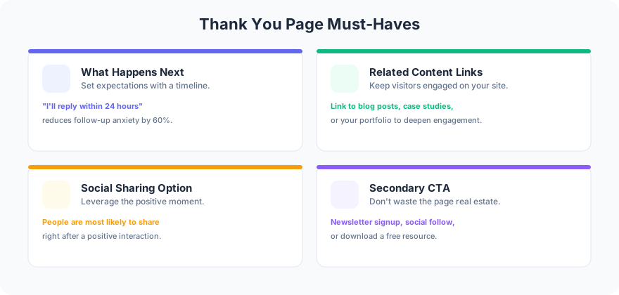
Add 2 to 3 content links to every thank you page. Google Analytics shows 30% of visitors click at least one. That is 30% more page views from people who already trust you enough to fill out a form.
3. Social Sharing Prompt
The visitor just took action with your business. That is the best moment to ask for a share. Not a generic “follow us on social media” banner. A specific prompt: “Know someone who needs a new website? Share this page with them.”
Limit sharing buttons to 2 platforms. For B2B clients, LinkedIn and email. For local businesses, Facebook and email. Too many options create decision paralysis. Two buttons get more clicks than six.
4. A Secondary CTA
The primary conversion already happened. Now offer a lighter, related action. “Browse our recent projects.” “Download our website planning checklist.” “Subscribe to our monthly tips email.”
One client added a “View Our Portfolio” button on their thank you page. Portfolio page views increased 38% in the first month. These visitors were already qualified leads actively researching the company.
The Dead End Problem
A thank you page with nothing on it is a website dead end that loses visitors. Every page on your site should answer the question: “What should the visitor do next?” Thank you pages are no exception. They are one of your highest-intent pages and deserve real design attention.
FAQ
Should you remove the main navigation from thank you pages?
No. Removing navigation traps visitors. Keep your standard header and nav intact. The four elements above guide behavior without restricting it. Visitors should always be able to navigate freely.
Can you use your thank you page for upselling?
Yes, but keep it light. A secondary CTA like “Upgrade to priority support” works if the tone stays helpful, not pushy. The visitor just converted. Respect that moment by offering value, not pressure.
If your thank you pages are blank walls, get in touch about post-conversion experiences that keep visitors engaged and moving forward.