Contact Page Best Practices: Design a Page That Generates Leads
Your contact page is where visitors decide to become leads. It is the last step before conversion. A confusing, cluttered, or intimidating contact page wastes every dollar you spent getting that visitor to your site.
This site’s contact page was redesigned with a two-column layout: the kinds of projects taken on (left) and a simple form (right). The structure is deliberate. Here is why it works and how to build yours.
The Ideal Contact Page Layout
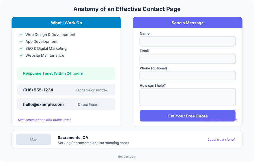
Left column: Context and confidence. Tell visitors what you work on (a checklist of services), your response time (“within 24 hours”), your phone number, and your email. This column answers every hesitation before they fill out the form.
Right column: The form. Name, email, phone (optional), message. Four fields maximum. A “Send Message” button with a specific label.
Below both: Location and map. Physical address for local credibility, embedded map for directions. This also feeds your LocalBusiness schema.
Do’s and Don’ts
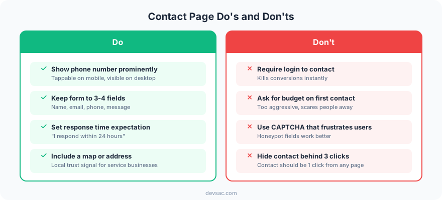
Show your phone number prominently. Some visitors want to call, not fill out a form. A tappable phone number in the header and on the contact page captures these leads.
Keep the form to 3-4 fields. Every additional field reduces completions by 5-10%. You do not need their company size, budget range, or how they heard about you on the first contact. Ask those questions after they reach out.
Set a response time expectation. “We respond within 24 hours” reduces anxiety. Without this, visitors wonder if their message will disappear into a void.
Do not require login to contact you. If someone needs an account to send a message, most will leave instead.
Do not ask for budget on first contact. Budget questions on contact forms create friction. Many prospects do not know their budget yet. Ask in the follow-up call.
Trust Elements That Increase Submissions
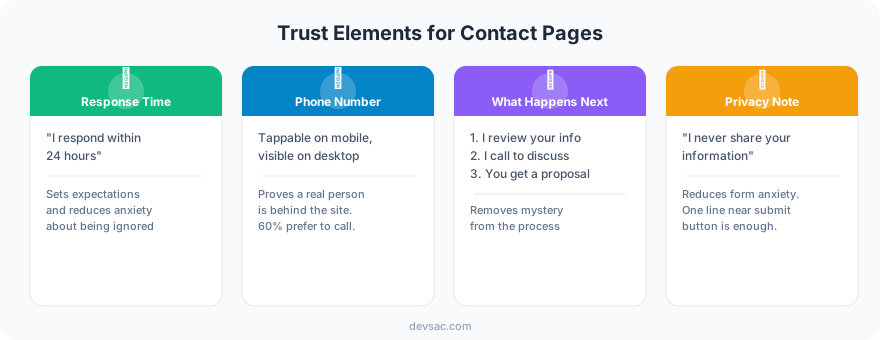
Your contact page needs the same trust signals as your service pages. A visitor who made it to your contact page is almost ready to convert. Do not lose them with a bare-bones page.
FAQ
Should my contact page have a phone number?
Yes. Some visitors prefer calling over filling out forms. A tappable phone number captures leads that a form-only page misses. Put it in the header, on the contact page, and in the footer.
How many fields should a contact form have?
3-4 fields: name, email, phone (optional), and message. Anything more reduces completions. If you need additional information (budget, timeline, project type), ask for it in the follow-up conversation.
Your contact page is the last page before a lead becomes a contact. Make it simple, trustworthy, and fast.
Need a contact page that converts? Get in touch.