Homepage Best Practices: 10 Elements Every Business Homepage Needs
Your homepage is the most important page on your website and the hardest one to get right. It gets more traffic than any other page, it carries the most backlinks, and it is the one URL where you know the least about what the visitor wants. They have not clicked anything yet. They could be a first-time visitor from Google, a referral from a friend, or a returning customer checking your hours.
I have built over 100 homepages across industries from restaurants to SaaS platforms. The pattern is consistent: homepages fail when they try to say everything and end up saying nothing. The best homepages do two jobs. They tell the visitor where they are, and they move the visitor deeper into the site.
Here are the 10 homepage best practices I follow on every build.
1. A Headline That Says What You Do
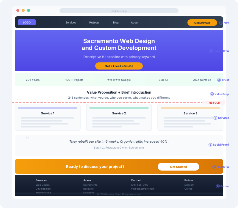
The homepage headline is the single most important piece of text on your entire website. It sits at the top of the visual hierarchy in the H1 tag. It tells both the visitor and Google what this business does.
The biggest mistake I see: using a clever tagline instead of a descriptive headline. “Elevating Your Digital Experience” tells nobody anything. “Sacramento Web Design and Custom Development” tells everyone exactly what you do.
Write your headline like you are explaining your business at a backyard barbecue. If someone would respond with “What does that actually mean?” your headline is too vague. Six to ten words, descriptive, and include your primary keyword.
2. A Value Proposition Above the Fold
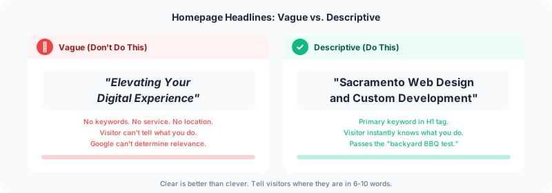
Below the headline, you have two to three sentences to explain why someone should pick you over everyone else. This is your positioning statement. What makes you different from the dozen other businesses that do what you do?
The value proposition should answer two questions: What category are you in? What sets you apart? On the sites I build through my web design services, the value proposition goes directly below the H1. No animation delays, no “scroll to reveal” effects. The visitor should read your headline and value proposition without touching their mouse.
3. Trust Signals Before the Scroll
Trust signals are the visual evidence that your business is legitimate. Client logos, certifications, years in business, project counts. These belong above the fold, not buried at the bottom of the page.
The psychology is simple: the halo effect. When a visitor sees logos of recognizable brands or certifications they respect, that credibility transfers to your brand. A startup born yesterday cannot show “20+ years experience” or “1,400+ campaigns managed.” That is your differentiator.
I add a trust bar to every homepage I build. On DevSac it shows aggregate stats: years of experience, number of projects, and articles published. On client sites it shows client logos, Google review ratings, or industry certifications. The format matters less than the placement. Put it high on the page where visitors see it before they decide whether to scroll.

4. One Clear Call to Action
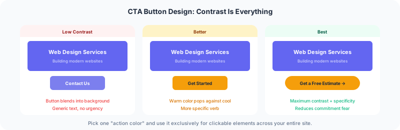
Every homepage needs one primary call to action. Not three. Not five. One. The visitor should never wonder “What do I do next?”
The CTA should use a contrasting color so it stands out from the surrounding design. It should use a specific verb: “Get a Free Estimate” outperforms “Contact Us” because it tells the visitor exactly what happens when they click. Place it high on the page, ideally in the navigation bar so it follows the visitor as they scroll.
Secondary CTAs can exist further down the page. But the primary action should be unmistakable within the first three seconds.
5. Navigation That Guides, Not Overwhelms
Navigation labels are SEO real estate. “Services” tells Google nothing. “Web Design Services” tells Google exactly what you offer. Use descriptive labels for every navigation item.
Keep the menu to five to seven items maximum. For most small businesses, the menu should be: what you do (services), who you are (about), proof you can do it (portfolio or projects), why to trust you (blog or resources), and how to hire you (contact). That covers every visitor intent. Your about page deserves as much attention as your homepage. I cover the full structure in about page best practices.
Dropdown menus work when they are big and useful. Small flyout menus with three items each create friction without payback. If you need dropdowns, make them mega menus with clear categories. If you do not have enough content for mega menus, skip dropdowns entirely.
6. Social Proof That Converts
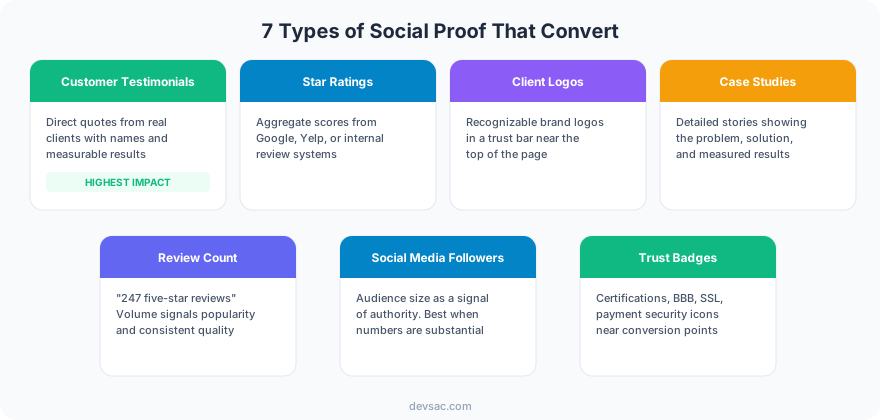
Testimonials and reviews are the most underused element on business homepages. 18% of homepages include video, and only about half feature any testimonials at all. That is a missed opportunity.
The most effective testimonials are specific. “Great work!” tells prospects nothing. “They rebuilt our site in 6 weeks and our organic traffic increased 40% in the first quarter” tells prospects everything they need to hear. Put testimonials near the content they support. A quote about your process goes next to your process section. A quote about results goes next to your case studies.
Do not hide testimonials behind a carousel. Stacking them vertically means more visitors see more testimonials. Carousel “next” buttons get clicked by roughly 5% of visitors, which means 95% only see the first quote.
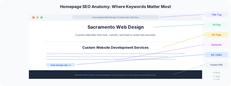
7. Homepage SEO Fundamentals
Your homepage is the one URL on your site with the most backlinks and the highest page authority. That makes it your strongest asset for ranking on competitive keywords.
Use your primary keyword in the H1 tag and the title tag. Then write comprehensive copy that naturally includes related phrases. This is semantic SEO: instead of repeating “homepage design” ten times, you write about headlines, CTAs, navigation, trust signals, and conversion. Google understands the relationship between these topics. The page becomes relevant for dozens of related searches without any keyword stuffing.
Every vague subheading on your homepage is a missed keyword opportunity. “Our Approach” could be “Our Web Design Process.” “What We Do” could be “Custom Website Development Services.” Specificity helps visitors and search engines simultaneously.
8. Real Faces, Not Stock Photos
Visitors connect with people, not logos. The fastest way to differentiate your homepage from competitors is to show real humans: your team, your founder, your customers.
Stock photos of handshakes, diverse teams in glass conference rooms, and people pointing at whiteboards signal “we did not invest in this.” One real photo of your actual office, your actual team, or you at your actual desk builds more trust than ten polished stock images.
For a solo practitioner like me, that means my photo, my name, and my experience front and center. For a team, it means real headshots with real names and titles. Visitors want to know who they are hiring before they fill out a contact form.
9. A Footer That Catches Stragglers
The footer is your safety net. It catches visitors who scrolled all the way down without finding what they needed. A good footer includes secondary navigation links, contact information, service area details, and one more call to action.
Think of the footer as a mini homepage for your most patient visitors. They scrolled past everything else, which means they are either very interested or very lost. Give them multiple paths: your phone number, your email, links to key service pages, and your physical address if you serve a local market.
I include area pages in every footer for local businesses. A Sacramento web design company should show every city it serves. That is useful for visitors and it is useful for local SEO.
10. What to Leave Off Your Homepage
Knowing what to remove is as important as knowing what to add.
Image carousels and sliders. Research consistently shows that content beyond the first slide gets almost zero engagement. Pick one message for the hero area and commit to it.
Auto-playing video backgrounds. They look cinematic and cost 10-20MB on mobile connections. Your hero section should communicate your value in text, not in a video that half your visitors will never see because they are on cellular data.
Social media icons in the header. You are inviting visitors to leave your site and go to a platform full of notifications and competitor ads. Put social links in the footer where they belong.
Walls of text without structure. If a section does not have a subheading, most visitors will skip it entirely. Break your copy into scannable chunks with descriptive headers.
Frequently Asked Questions
What are best practices for homepage design?
Homepage design best practices focus on clarity, trust, and conversion. Start with a descriptive headline that includes your primary keyword. Add trust signals (client logos, stats, certifications) above the fold. Include one clear call to action with a contrasting color. Use descriptive navigation labels. Add social proof through testimonials. Write comprehensive copy that addresses visitor questions. End with a footer that provides secondary navigation and contact information.
Your homepage works harder than any other page on your site. If yours is not converting visitors into leads, the fix is usually structural, not cosmetic. My lead generation website guide covers the full site architecture that turns traffic into inquiries. Get in touch and I will audit your homepage against these 10 practices.