How to Create a Call to Action That Converts
A call to action is the moment your website earns its investment. Everything else on the page, the headlines, the images, the testimonials, exists to lead the visitor to this moment. Click. Submit. Call. Convert.
Across hundreds of CTAs tested on client sites, the difference between a CTA that converts at 1% and one that converts at 4% is not magic. It is specific language, strategic placement, and visual contrast.
Anatomy of a High-Converting CTA
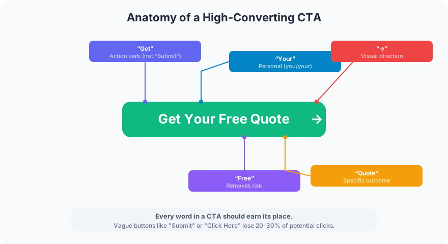
Every high-converting CTA follows this structure:
Action verb. Start with what happens when they click. “Get,” “Start,” “Book,” “Download.” Never “Submit” (that is a form label, not a CTA).
Personal language. Use “your” and “you.” “Get Your Free Quote” outperforms “Get a Free Quote” because it makes the offer feel personalized.
Risk removal. “Free,” “No obligation,” “15-minute.” Anything that reduces the perceived commitment lowers the barrier to clicking.
Specific outcome. Tell visitors exactly what happens next. “Get Your Free Quote” is better than “Contact Us” because the visitor knows what they will receive.
Visual direction. An arrow (→) or visual cue pointing toward the action reinforces the direction of movement.
Where to Place CTAs
Placement matters as much as wording. A great CTA in the wrong location gets ignored.
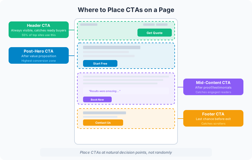
Header CTA. Always visible, catches visitors who arrive ready to act. 55% of marketing websites include a CTA button in the header. If yours does not, you are losing ready buyers on every page.
Post-hero CTA. Placed after your value proposition and headline. This is the highest-converting position because the visitor has just learned what you do and why it matters.
Mid-content CTA. After testimonials or proof sections. Visitors who have read this far are engaged. Give them an action to take at the peak of their confidence.
Footer CTA. The last chance before the visitor leaves. Visitors who scroll to the bottom are engaged but may not have found what they needed. A footer CTA with different wording (“Still have questions? Let’s talk.”) catches this audience.
Service pages get CTAs at all four positions. Blog posts get, at minimum, the header and end-of-content positions.
Words That Convert
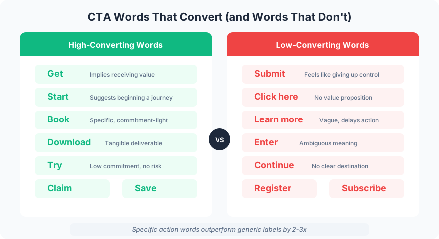
High-converting words: Get, Start, Book, Download, Try, Claim, Save. These words tell the visitor exactly what action they are taking and what they will receive.
Low-converting words: Submit, Click here, Learn more, Enter, Continue, Register, Subscribe. These words are vague, passive, or feel like a commitment the visitor is not ready for.
The difference is measurable. Specific action words outperform generic labels by 2-3x in click-through rates across every client test.
CTA Design Rules
Contrast is mandatory. Your CTA button must be the most visually prominent element in its section. If your site uses blue, make the button green or amber. If visitors have to search for the button, it is not doing its job.
Size matters. A CTA button should be large enough to notice without being so large that it feels aggressive. On desktop, 44-60px tall is standard. On mobile, 48px minimum for comfortable tapping.
White space protects attention. Give your CTA button breathing room. Crowded CTAs get lost in the visual noise around them. At least 20-30px of padding on all sides.
One primary CTA per section. Multiple competing buttons confuse visitors. Each section of a page should have one clear action. Secondary links (text links, not buttons) can offer alternatives without competing.
Common CTA Mistakes
“Submit” on contact forms. This is the most common CTA mistake on the internet. Replace it with something specific: “Send Message,” “Get My Quote,” or “Book a Call.”
Same CTA everywhere. If every button on your page says “Contact Us,” you are not giving visitors a reason to choose one over another. Vary the language based on context.
Hiding the CTA below the fold. If a visitor has to scroll to find out how to contact you, you have lost every visitor who does not scroll. Put a CTA in the header and above the fold.
CTA without context. A button that says “Get Started” with no surrounding content telling the visitor what they are starting is a missed opportunity. Pair every CTA with a sentence that reinforces the value.
FAQ
How many CTAs should a page have?
Service pages should have 3-4 CTAs at natural decision points (header, post-hero, after proof, footer). Blog posts should have at least 2 (one in the header area, one at the end). Landing pages should have 1 primary CTA with minimal distractions.
What color should a CTA button be?
The color that contrasts most with your site’s color scheme. There is no universally “best” color. Orange buttons work on blue sites. Green buttons work on white sites. The key is contrast, not a specific color.
Should CTAs open a new page or stay on the same page?
CTAs that link to your own site (contact form, pricing page) should stay on the same page (no new tab). CTAs that link to external tools (booking calendars, payment systems) can open in a new tab to preserve the user’s place on your site.
Your CTA is where design, copy, and psychology converge. Get the words right, put it in the right place, make it visually unmissable, and your conversion rate will reflect the effort.
Want CTAs that actually convert? Get in touch to optimize your site.