Best Restaurant Websites: 7 Designs That Drive Orders
77% of diners check a restaurant’s website before deciding where to eat. And the number one thing they look for is the menu. If your menu is a blurry PDF that requires pinching and zooming on a phone, you just lost a table to the restaurant down the street with an actual web menu.
The best restaurant websites do three things: show the food, show the menu, and make it easy to order or reserve. Here is how seven restaurants get it right.

What Every Restaurant Website Needs

Before the examples, the non-negotiables. These are the features that every restaurant website should have, and the ones most restaurants get wrong:
An HTML menu, not a PDF. PDFs are not searchable by Google. They are hard to read on mobile. They cannot be updated quickly when prices change or items rotate. A proper web menu with text, categories, and prices is better for SEO, better for users, and better for your staff.
Online ordering without third-party commission. DoorDash, Uber Eats, and Grubhub take 15-30% per order. A restaurant doing $5,000/month through delivery apps is paying $750 to $1,500 in commissions. Direct online ordering through your own website costs a fraction of that. The math is not close.
Hours and location without clicking. Your hours, address, and phone number should be on every page, not just the contact page. Most people arrive from Google and land on different pages. If they have to hunt for basic information, they leave.
Mobile-first everything. Over 70% of restaurant website traffic comes from mobile devices. People are looking at your site while walking down the street deciding where to eat. If the menu takes 10 seconds to load or the reservation button is too small to tap, that decision gets made for your competitor.
1. Eleven Madison Park
EMP’s website matches the restaurant’s reputation: minimal, intentional, and beautiful. The homepage is a single photograph with the restaurant name. The menu page is clean text with zero clutter. No prices on the web (it is a fixed-price restaurant), but the experience, the story, and the seasonal focus come through in every word.
What works: For fine dining, the website is an extension of the atmosphere. EMP’s site makes you feel something before you ever walk through the door. The photography is editorial quality, and it does more to sell a $365 tasting menu than any list of ingredients could.
2. Sweetgreen
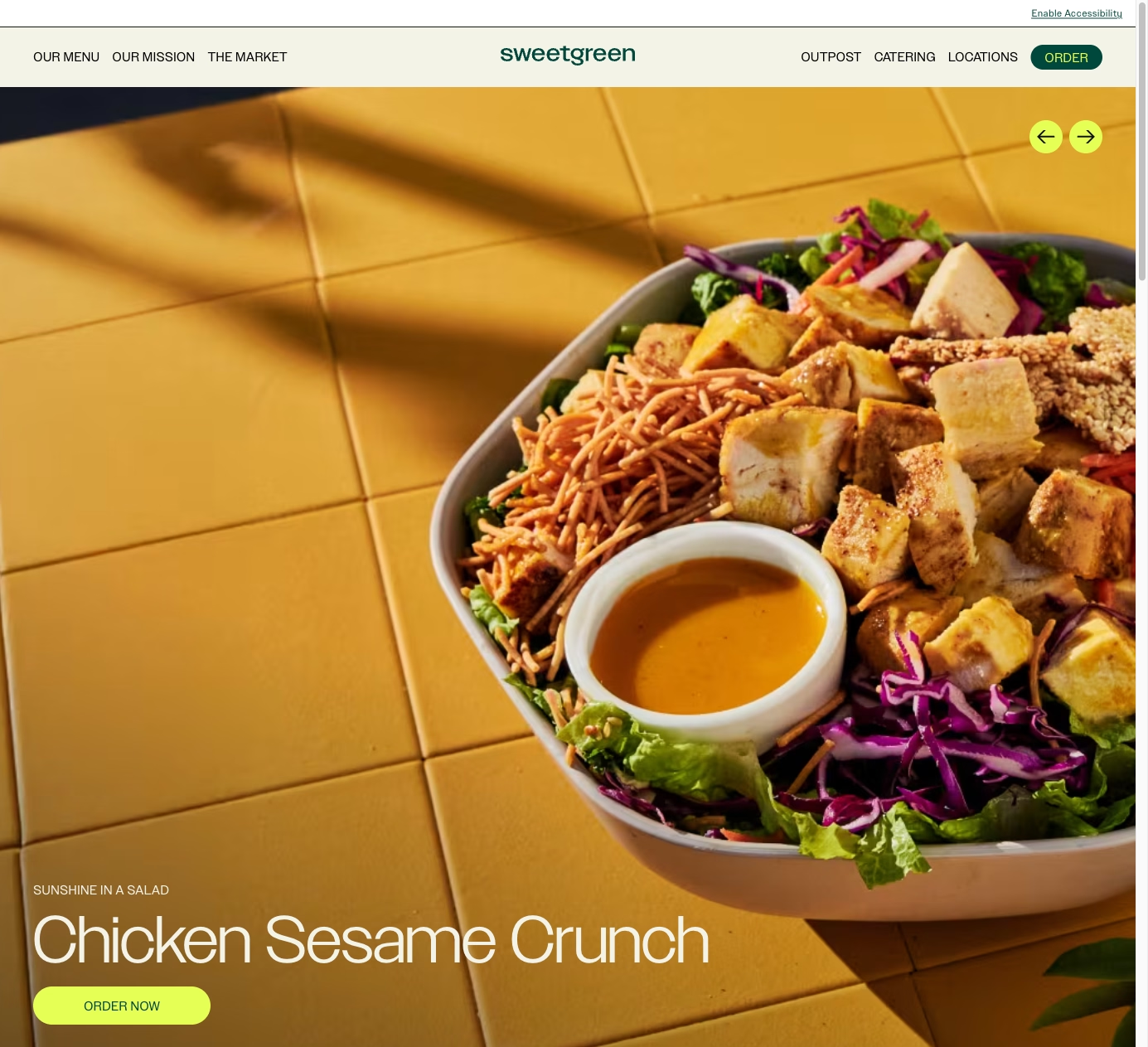
Sweetgreen treats their website like a tech product. The ordering flow is seamless: pick a location, build or choose a bowl, customize, pay. The entire experience happens in-browser with no app install required. Menu items show ingredients, calories, and allergen information. The design is clean, fast, and green (literally).
What to steal: The frictionless ordering flow. Every restaurant offering online ordering should study this. No account required to browse the menu. Location selection happens automatically based on GPS. The path from “I’m hungry” to “order placed” is under 60 seconds.
3. Shake Shack
Shake Shack’s site balances brand personality with functionality. The menu page uses large food photography with clear prices and descriptions. The location finder shows wait times, which is a feature most restaurant websites do not have. The site is fast on mobile, and the ordering flow integrates with their app while still working fully in the browser.
What to steal: Wait time visibility. If you can show customers how busy you are in real time, you reduce walkaway frustration and help them plan their visit. Even an approximate “typically busy at this time” indicator helps.
4. Noma
Noma’s website is a masterclass in storytelling for restaurants. Seasonal menus, foraging documentation, team profiles, and a journal that reads like a food magazine. For a restaurant that closed and reopened as a food lab, the website is the primary communication channel with their audience.
What works: Content that creates demand. Noma does not need SEO. But the model of publishing behind-the-scenes content, seasonal ingredient stories, and chef perspectives builds a relationship with potential diners that goes beyond “check the menu.” Any restaurant with an interesting story to tell should be publishing that story on their website.

5. Domino’s
Domino’s is a technology company that sells pizza. Their website and app handle over 75% of their orders. The pizza tracker, the ordering flow, the saved favorites, the deal builder, every feature is designed to reduce friction between “I want pizza” and “pizza is on the way.” Love it or hate it, Domino’s has the most optimized restaurant ordering experience online.
What to steal: Saved orders and reordering. Regular customers should be able to reorder their usual in two clicks. Most independent restaurant ordering systems require customers to rebuild their order from scratch every time. Adding order history and a “reorder” button increases order frequency from repeat customers.
6. The French Laundry
Thomas Keller’s site for The French Laundry is elegant and sparse. The focus is on the experience: the garden, the kitchen, the team, the property. The reservation system (handled through Tock) is integrated smoothly. Photography carries the site, with images that communicate the level of care in every dish.
What works: Photography as the primary sales tool. For restaurants where the food is the differentiator, professional photography is the highest-ROI investment in the website. A $2,000 photo shoot that produces 30 stunning food images will generate more reservations than any amount of copy.
7. Chipotle
Chipotle’s website prioritizes speed and customization. The ordering flow starts with the category (burrito, bowl, tacos), moves to protein, then toppings, in a linear flow that mirrors the in-store experience. Nutrition information is inline, not hidden behind a link. The catering ordering system handles large orders with the same simplicity.
What to steal: The linear ordering flow that mirrors the in-store experience. Customers already know how to order at your restaurant. The website should feel like the same process, not a completely different interface. Familiarity reduces cognitive load and increases conversion.
Mistakes That Cost Covers
The PDF menu. This is the single most common restaurant website failure. PDF menus are invisible to Google, miserable on mobile, and impossible to update quickly. Convert your menu to HTML text on a proper web page.
No online ordering (or third-party only). If the only way to order online is through DoorDash, you are paying 30% of revenue for the privilege of not having your own ordering system. A basic direct ordering integration pays for itself within the first month.
Outdated hours and specials. If your website says you are open until 10 PM but you close at 9 PM on Tuesdays, someone is going to show up to a dark restaurant. Keep hours, holiday closures, and seasonal menus current.
Background music. Do not auto-play audio on your website. This should not need to be said in 2026, but it does.
No Google Business Profile link. Your Google Business Profile drives directions, calls, and reviews. Your website should reinforce it with consistent NAP (name, address, phone) data and a link to your profile for reviews.
Building a Restaurant Website That Fills Tables
The restaurants above range from fast-casual to fine dining, but the conversion principles are the same. Show the food. Show the menu. Make it easy to order or reserve. Do it all on mobile.
I build restaurant websites that replace PDF menus with proper web menus, integrate direct online ordering to cut delivery app commissions, and handle the local SEO that puts your restaurant in the map pack when someone searches “restaurants near me.” Let’s talk about your restaurant’s website.