Best Law Firm Websites: What Top Firms Do Differently
77% of people looking for a lawyer start online. The first thing they see is your website. If it looks like it was built in 2012, loads slowly on mobile, or buries the phone number behind three clicks, they move on to the next firm in the search results. The consultation goes to the firm with the better website, not necessarily the better attorney.
After building websites for professional service firms, I have seen what works and what does not. Here is what the best law firm websites do differently, with real examples and patterns you can apply to your own site.

The Patterns That Convert

Law firm websites have one job: turn a visitor into a consultation. Every design decision should serve that goal. The firms that generate the most leads from their websites share these traits:
Phone number in the header, not just the contact page. When someone searches “personal injury lawyer near me” at 11 PM after an accident, they need the phone number immediately. Click-to-call on mobile. Visible on desktop without scrolling. The best firms also include a short form (name, phone, brief description) as a secondary conversion path for people who are not ready to call.
Practice area pages with real depth. “We handle personal injury cases” is not a practice area page. A page that explains what happens after a car accident, what evidence to preserve, how insurance companies try to minimize payouts, and what the typical timeline looks like, that is a practice area page. It builds trust, demonstrates expertise, and ranks for long-tail keywords.
Attorney bios that build trust. Generic headshots with a list of law schools do not convert. The best attorney bios include a personal statement about why they practice their area of law, specific case results (with appropriate disclaimers), bar admissions, speaking engagements, and professional photos that show personality.
Client testimonials with specifics. “Great lawyer, would recommend” does not move the needle. “After my car accident, the insurance company offered $15,000. [Attorney name] negotiated a $175,000 settlement in four months” tells a story that a prospective client can see themselves in.
1. Morgan & Morgan
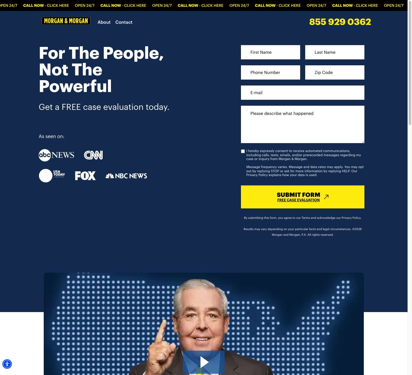
Morgan & Morgan runs one of the highest-traffic law firm websites in the country. The homepage is a conversion machine: a full-width consultation form above the fold, click-to-call phone number, and a chat widget. Every practice area has its own detailed landing page with FAQ schema markup. The site loads fast on mobile despite being image-heavy because they invest in performance optimization.
What works: The consultation form is the entire above-the-fold experience. There is no confusion about what to do next. They also publish case results by practice area, which builds credibility and helps with SEO for “[practice area] settlement amounts” keywords.
2. Cravath, Swaine & Moore
Cravath represents the other end of the spectrum: a corporate law firm that does not need walk-in clients. Their site is clean, minimal, and information-dense. The focus is on thought leadership, lateral hire recruiting, and client communications. Attorney profiles are detailed and professional. The news section positions the firm as a leader in M&A, litigation, and corporate governance.
What works: Knowing the audience. Cravath’s visitors are corporate counsel, not accident victims. The design reflects that: authoritative, calm, detail-oriented. A personal injury firm should not copy this design, but a corporate or IP firm should study it.
3. AllLaw / Nolo
AllLaw and Nolo are not law firms. They are legal information publishers. But they demonstrate what law firm content should look like. Comprehensive guides on legal topics, organized by practice area, written in plain language, and optimized for search. Their “How much is my personal injury case worth?” calculator is one of the highest-traffic pages in legal search.
What to steal: The content depth. Most law firm blogs are 300-word posts that rank for nothing. AllLaw proves that comprehensive, practical content on legal topics drives massive organic traffic. A law firm that publishes this quality of content on their own domain builds authority that legal directories cannot match.
4. Cooley LLP
Cooley’s website targets the startup and tech ecosystem. The design is modern and clean, matching the aesthetic expectations of Silicon Valley founders and VCs. Their industry pages (emerging companies, life sciences, technology) read as sector expertise, not practice areas. The talent section is prominent because lateral recruiting is a key business driver.
What works: Industry alignment. Cooley’s site looks and feels like a tech company website, which is exactly what their clients expect. The industry-organized navigation (instead of practice-area-organized) lets visitors self-select based on their business, not their legal problem.

5. Injured.com
Injured.com is a lead generation site, not a firm site, but it demonstrates conversion optimization at scale. Every page has multiple conversion points: header form, inline forms, click-to-call buttons, and chat. The content covers specific accident types, injury types, and jurisdictions with dedicated landing pages for each combination.
What to steal: The landing page specificity. “Car accident lawyer Sacramento” should have a different landing page than “personal injury lawyer Sacramento.” Each page addresses the specific situation, includes relevant local information, and has its own conversion path. This level of specificity requires more pages but dramatically improves conversion rates because visitors see content that matches their exact situation.
6. Quinn Emanuel
Quinn Emanuel’s website is confident and understated. They lead with results: case summaries, trial victories, and recognition. The design says “we win cases” without saying it. Attorney bios are substantial, with career highlights and representative matters. The overall aesthetic is premium without being flashy.
What works: Leading with outcomes. Prospective clients hiring a trial firm want to see a track record of winning. Quinn Emanuel’s site is structured around proof of results, which is the strongest trust signal a litigation firm can offer.
7. LegalZoom
LegalZoom is a legal services company, not a firm, but their website sets the usability standard. Clear service categories, transparent pricing, step-by-step process explanations, and a buying experience that feels like e-commerce. For law firms that offer fixed-fee services (estate planning, business formation, trademark registration), this is the model to study.
What to steal: Transparent pricing. Most law firm websites avoid discussing cost entirely. LegalZoom proves that transparent pricing reduces friction and increases conversions. If your firm offers any services at fixed rates, publishing those rates online gives you an advantage over every competitor who forces visitors to call for a quote.
Mistakes That Cost Consultations
Stock photos of gavels, handshakes, and scales of justice. Every law firm website uses them. They signal nothing except “we bought a template.” Use real photos of your office, your team, and your community.
No mobile optimization. 60%+ of law firm website traffic is mobile. If your consultation form requires pinching and zooming, or if your phone number is an image instead of a clickable link, you are losing leads.
Missing practice area depth. A list of practice areas with one paragraph each is a directory listing, not a website. Each practice area needs its own page with enough content to rank and enough detail to build trust.
No clear call to action. If a visitor reads your entire homepage and does not see a phone number, a form, or a “Free Consultation” button, they will leave. Every page should have a visible next step.
Building a Law Firm Website That Generates Cases
The best law firm websites share a focus on conversion, content depth, and trust signals. Whether you are a solo practitioner or a 500-attorney firm, the same principles apply: make it easy to contact you, demonstrate expertise through content, and show results that build confidence.
I build law firm websites that are designed to generate consultations, not just look professional. From practice area content strategy to mobile-first design and local SEO, every decision is driven by what actually converts visitors into clients. Let’s talk about your firm’s website.