Best Medical Practice Websites: What Patients Look For
77% of patients search online before booking with a new provider. The first impression is not your waiting room. It is your website. If it loads slowly, looks outdated, or buries the “Book Appointment” button behind three clicks, that patient books with the next provider in the search results.
Here is what the best medical practice websites do differently, with examples you can apply to your own practice’s site.

What Patients Want From a Medical Website

After reviewing dozens of healthcare practice websites, the conversion pattern is consistent. Patients want four things, in this order:
-
Can I book an appointment online? 80% of patients prefer online scheduling. Not a contact form that promises a callback. Real-time availability with confirmed booking.
-
Do you accept my insurance? This is the single biggest filter. If the answer is not immediately findable, patients move on.
-
What do other patients say? Reviews and testimonials from real patients build trust faster than any amount of provider credentials.
-
Is this provider right for my problem? Condition and service pages that explain what the practice treats, how, and what to expect.
1. Cleveland Clinic
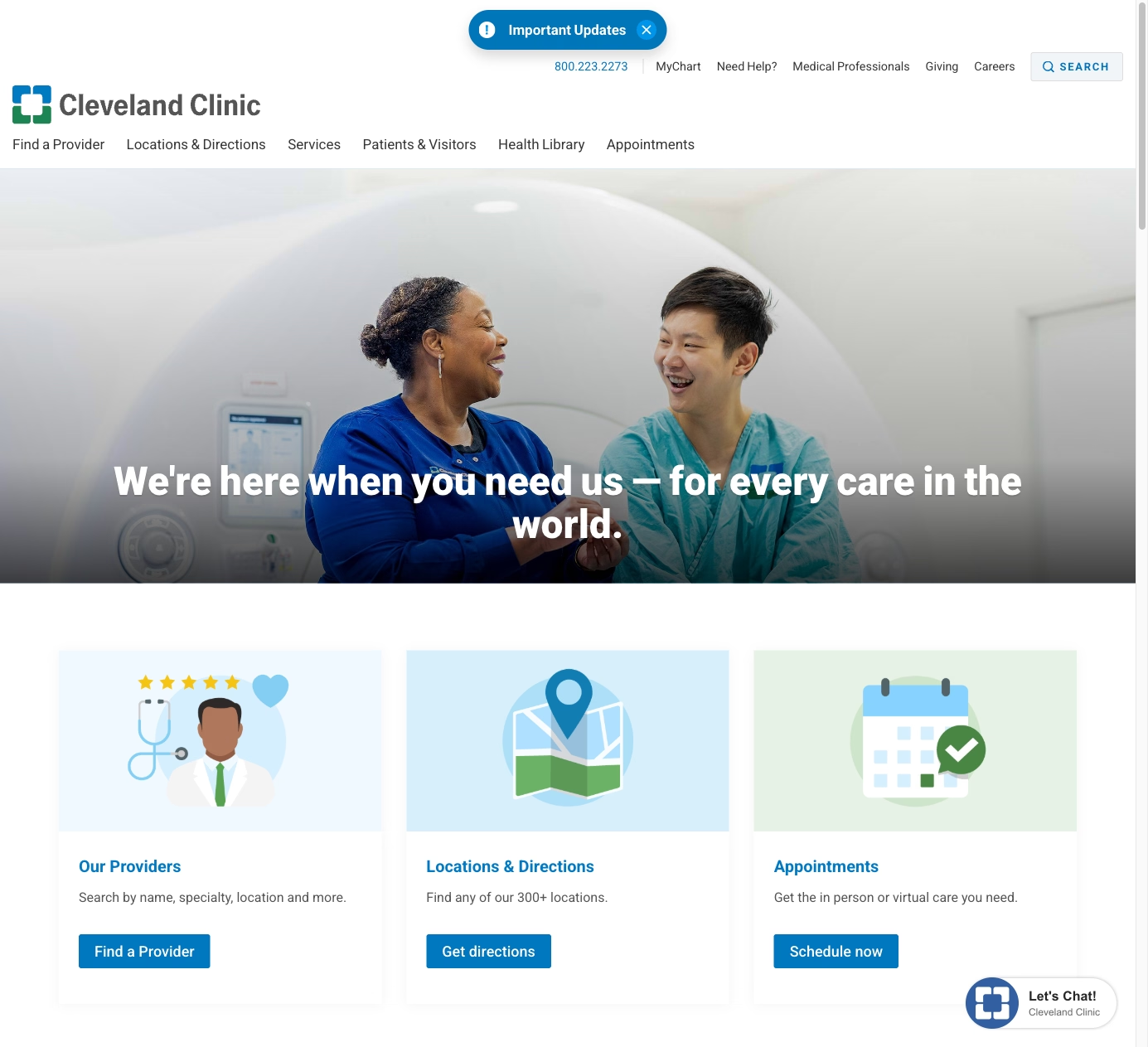
Cleveland Clinic’s website is the gold standard for healthcare content. Their Health Library has thousands of condition pages, each written in patient-friendly language with symptoms, causes, treatments, and when to see a doctor. This content strategy drives millions of organic visits per month and positions Cleveland Clinic as the trusted authority before a patient ever walks in.
What works: Content volume and quality. Every condition they treat has a comprehensive page. Patients searching “what causes chest pain” or “how long does a sprained ankle take to heal” find Cleveland Clinic’s answer first. That trust translates to appointments when the patient needs care.
2. One Medical
One Medical redesigned the primary care experience, and their website reflects it. The booking flow is immediate: pick a location, pick a provider, see available times. The membership model is explained clearly with pricing upfront. The design is warm, modern, and intentionally non-clinical, using photography and copy that make healthcare feel approachable.
What to steal: The booking experience. One Medical’s scheduling is as frictionless as booking a restaurant reservation. Pick a time, confirm, done. Every practice should aim for this level of simplicity, even if the backend requires integration with an EHR.
3. Mayo Clinic
Mayo Clinic’s website handles the challenge of being both a world-class research institution and a patient care provider. The patient section is separated from the research section, so someone looking to book an appointment does not get lost in clinical trial data. The “Request Appointment” flow is prominent and guides patients through a brief intake before connecting them with the right department.
What works: Intelligent routing. A large multi-specialty practice cannot have one “Book Now” button. Mayo’s intake flow asks the right questions to connect patients with the correct department, reducing phone tag and improving the patient experience before the first visit.
4. ZocDoc
ZocDoc is not a practice, but it sets the standard for medical scheduling UX. Search by specialty, insurance, location, and availability. See real patient reviews, provider photos, and accepted insurance before booking. The entire flow, from search to confirmed appointment, takes under two minutes.
What to steal: The insurance filter. ZocDoc’s most valuable feature is filtering providers by insurance before showing results. Any practice website that lets visitors confirm insurance acceptance before they invest time browsing has a conversion advantage.

5. Kaiser Permanente
Kaiser’s website manages the complexity of being both an insurer and a provider. The member portal handles appointments, prescription refills, test results, and messaging with providers. For non-members, the site clearly explains plans, coverage, and how to join. The mobile experience is particularly strong because Kaiser knows their members manage healthcare from their phones.
What works: The patient portal integration. Once a patient is in the system, the website becomes their primary healthcare management tool. Practices that integrate patient portals into their website (not just link to a separate system) create a stickier relationship that improves retention.
6. Parsley Health
Parsley Health targets patients frustrated with conventional medicine. Their website speaks directly to this audience: “Is this the kind of care you’ve been looking for?” The design is clean and wellness-oriented. Provider bios emphasize functional medicine credentials and personal health journeys. The content focuses on root cause treatment rather than symptom management.
What to steal: Audience-specific messaging. Parsley Health knows exactly who their patient is and speaks to them directly. A practice that specializes in sports medicine, geriatrics, or pediatrics should tailor their website’s voice and imagery to their specific patient population, not use generic healthcare templates.
7. CityMD
CityMD’s website is optimized for urgency. The homepage shows wait times at nearby locations in real time. Hours are prominent (most locations are open 7 days). The service list focuses on what urgent care handles versus when to go to the ER. For a walk-in clinic, the website’s job is to remove hesitation, and CityMD’s design does this efficiently.
What to steal: Real-time wait times. If your practice has walk-in availability, showing current wait times on the website reduces no-shows and manages expectations. Even estimated wait times (“typically 15-30 minutes at this time”) help patients plan.
Mistakes That Lose Patients
No online scheduling. A phone number and a contact form are not enough. Patients expect real-time booking in 2026. Practices that require phone calls to schedule lose patients to competitors who offer online booking.
HIPAA-unfriendly contact forms. Standard website contact forms transmit data without encryption. Patient intake forms, appointment requests that include health information, and any form that collects PHI must use HIPAA-compliant form handling. This is a legal requirement, not a nice-to-have.
Generic stock photography. Patients want to see the actual office, the actual providers, and the actual team. Professional photography of your space and staff builds trust that stock photos of stethoscopes cannot.
Missing provider bios. Patients want to know who they are going to see. A name, credentials, and a headshot are the minimum. A bio that includes specialties, approach to care, and a professional photo builds the relationship before the first appointment.
Poor mobile performance. Over 60% of healthcare searches happen on mobile. If your website takes more than 3 seconds to load on a phone, you are losing patients. Heavy image sliders and complex animations are the usual culprits.
Building a Medical Website That Books Patients
The best medical practice websites share a commitment to removing friction between “I need a doctor” and “I have an appointment.” Online scheduling, insurance transparency, patient-friendly content, and mobile-first design are the fundamentals.
I build medical practice websites that are designed to book appointments and build patient trust. From HIPAA-compliant forms to provider profiles and local SEO that puts your practice in front of patients searching in your area. Let’s talk about your practice’s website.