Best Dental Websites: Designs That Book Appointments
8 out of 10 patients search online before choosing a dentist. The practice with the better website gets the appointment. Not the practice with more experience, better reviews, or lower prices. The one with the website that loads fast on a phone, shows the office, and lets you book without calling.
After reviewing dozens of dental practice websites, the pattern is clear. Here is what the best dental websites do, and what most practices get wrong.

What Converts Patients Online

Dental website visitors have one question: “Is this the right dentist for me?” Every element on the page should answer that question. The practices that generate the most online appointments share these traits:
Online scheduling without a phone call. 67% of patients prefer booking online over calling. If your website’s only conversion path is a phone number, you are losing the majority who will not pick up the phone during business hours. A booking widget that shows available slots and confirms instantly is the single highest-ROI feature a dental website can add.
Before-and-after galleries. For cosmetic dentistry, veneers, whitening, and orthodontics, before-and-after photos are the most persuasive content on the page. Real patient results (with consent) beat stock photos every time. The best galleries organize by procedure type and include brief descriptions of the treatment.
Insurance and payment information upfront. “Do you take my insurance?” is the first question most patients ask. Listing accepted insurance plans on a dedicated page (not buried in a FAQ) and explaining payment options, financing, and what to expect for out-of-pocket costs removes the biggest barrier to booking.
Team photos that show personality. Generic headshots against a white background do not build trust. Photos of the team in the office, interacting with patients (with consent), or showing the actual treatment rooms help anxious patients feel comfortable before they walk in.
1. Aspen Dental
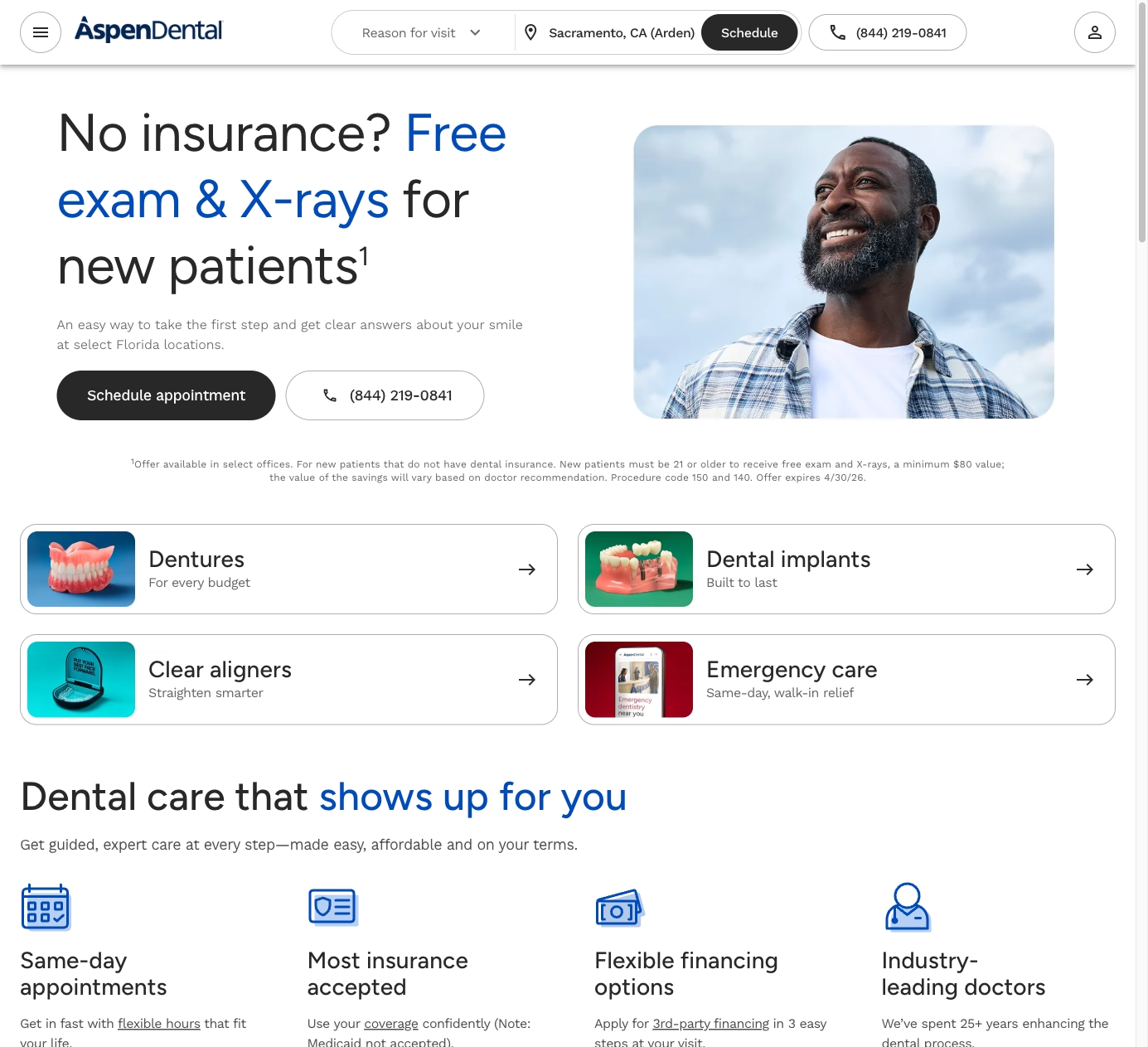
Aspen Dental’s website is a conversion machine built for scale. The homepage leads with a location finder and “Book Now” button. Every service page includes pricing transparency (“Dentures starting at…”) and financing options. The new patient experience is mapped step by step: what to bring, what to expect, and how long the first visit takes.
What works: Pricing transparency. Most dental websites avoid discussing cost. Aspen Dental’s willingness to show starting prices reduces anxiety and pre-qualifies patients who can afford the services.
2. Smile Direct Club
Smile Direct Club’s website sells a single product (clear aligners) and does it exceptionally well. The homepage presents a clear value proposition, a price comparison against traditional braces, and a “Take the Free Assessment” CTA. The quiz-style assessment collects lead information while educating the visitor about their options. Before-and-after results are front and center.
What to steal: The assessment quiz. For practices that offer specific treatments (Invisalign, implants, cosmetic procedures), a short online assessment that helps visitors understand if they are a candidate generates qualified leads while providing value.
3. Pacific Dental Services
PDS manages over 900 dental offices, and their website handles the complexity of multi-location search well. The location finder is fast and detailed: each office page shows the team, accepted insurance, available services, hours, and real photos of that specific location. The design is clean and clinical without being cold.
What works: Location-specific content. Each office page is unique, with real team photos and specific insurance information. This is better for local SEO than identical template pages and better for patients who want to know about their specific office.
4. Tend Dental
Tend’s website looks like a consumer tech company, not a dental practice. The design is bold, colorful, and photo-heavy. The booking flow is seamless: pick a location, pick a service, see available times, book in under 60 seconds. The “What to Expect” content addresses dental anxiety directly with calming language and photos of modern, non-clinical spaces.
What to steal: Addressing dental anxiety on the website. 36% of adults have dental anxiety. Tend’s design, copy, and photography all work to make the experience feel approachable. Any practice can do this with honest photography of their office and direct language about patient comfort.

5. Dentistry.com
Dentistry.com is an information publisher, not a practice, but their content strategy demonstrates what dental websites should publish. Comprehensive guides on procedures, conditions, costs, and insurance coverage drive massive organic traffic. The content is written for patients (not dentists) and covers the questions people actually search for.
What to steal: Patient education content. “How much do dental implants cost?” gets thousands of searches per month. A practice that publishes a detailed, honest answer on their own website captures that traffic instead of losing it to a third-party publisher.
6. Bupa Dental Care
Bupa’s dental site excels at treatment page depth. Each procedure has its own page with: what it involves, who it is for, what it costs, how long it takes, and aftercare instructions. The content is comprehensive without being clinical. Treatment pages link to booking, creating a clear path from education to appointment.
What works: Treatment pages that answer every patient question. When someone Googles “dental crown procedure,” the practice that provides the most helpful answer earns the trust and the appointment.
7. Bright Dental
Bright Dental’s website demonstrates what a single-location practice can do well with limited resources. Clean design, real office photography, clear service descriptions, and a prominent booking button. No unnecessary complexity. The reviews section pulls from Google and is prominently featured, which builds trust for a practice that does not have national name recognition.
What to steal: Letting real reviews do the selling. A single-location practice does not need a marketing budget to build trust online. Prominent display of genuine patient reviews is the most cost-effective trust signal available.
Mistakes That Lose Patients
PDF menus of services. List your services as web pages, not downloadable documents. Each service should have its own page with enough content to rank in search and answer patient questions.
No online booking. A phone number is not enough. Patients searching at 10 PM want to book now, not call tomorrow. Even a simple contact form that requests a preferred time is better than phone-only.
Stock photos of models with perfect teeth. Patients can tell. Use real photos of your office, your team, and (with consent) your actual patient results.
Missing insurance information. If a patient cannot quickly confirm you accept their insurance, they will find a dentist whose website answers that question.
Slow mobile experience. Large image sliders, auto-playing videos, and heavy JavaScript frameworks kill mobile performance. Your website needs to load in under 3 seconds on a phone. Most dental website templates do not meet this threshold.
Building a Dental Website That Fills Chairs
The best dental websites share a focus on reducing friction. Easy booking, clear pricing, real photography, and content that answers the questions patients are already asking. Whether you are a solo practitioner or a multi-location group, these principles drive appointments.
I build dental websites that are designed to book appointments, not just look professional. Online scheduling integration, insurance verification, before-and-after galleries, and local SEO that puts your practice in the map pack. Let’s talk about your practice’s website.