ADA Website Compliance: What Businesses Need to Know in 2026
Over 4,000 ADA website accessibility lawsuits were filed in 2023. That number has gone up every year since 2018. Most of the businesses that got sued had no idea their website was non-compliant until the demand letter arrived. The fixes are straightforward. The problem is that most developers and business owners do not know what to check.
I run WCAG accessibility audits on every website I build. Here is what you actually need to know about ADA website compliance, what the common failures are, and how to fix them.
What the Law Says
The Americans with Disabilities Act (ADA) requires businesses that serve the public to make their services accessible to people with disabilities. Courts have consistently ruled that websites count as “places of public accommodation” under Title III. If you have a physical business that is open to the public, or if you operate primarily online, your website falls under the ADA.
There is no official ADA website standard. But courts and the Department of Justice have pointed to the Web Content Accessibility Guidelines (WCAG) 2.1 Level AA as the benchmark. WCAG is published by the World Wide Web Consortium (W3C) and is the international standard for web accessibility. When a lawsuit lands, WCAG 2.1 AA is the yardstick.
26% of US adults have some form of disability. That is not a niche audience. That is a quarter of your potential customers.
The Most Common Failures
After auditing dozens of websites, I see the same problems repeatedly. These are the issues that trigger lawsuits, and the ones automated scanners miss.

Missing or Bad Alt Text
Every image on your website needs descriptive alt text that tells screen reader users what the image shows. “IMG_4582.jpg” is not alt text. “Photo” is not alt text. “A Sacramento dental office reception area with natural lighting and comfortable seating” is alt text.
Decorative images (backgrounds, dividers, icons that duplicate adjacent text) should have empty alt attributes (alt=""), which tells screen readers to skip them entirely. Most sites either have no alt text at all or have the same generic description on every image.
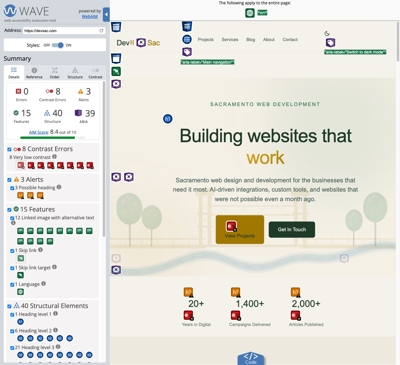
Insufficient Color Contrast

WCAG AA requires a contrast ratio of at least 4.5:1 for normal text and 3:1 for large text (18px+ bold or 24px+ regular). This is where “design-forward” websites consistently fail. Light gray text on white backgrounds. Thin fonts in muted colors. Placeholder text that is barely visible even for users with perfect vision.
When I audited this site’s dark mode, I checked every text and background combination against the stricter AAA standard (7:1 ratio). Headings came in at 15.85:1. Body text at 10.94:1. The green accent color at 9.21:1. Meeting AAA is not required by law, but hitting AA should be the minimum for any professional website.
Keyboard Navigation Failures
Every interactive element on your website, links, buttons, forms, menus, modals, must be operable with a keyboard alone. No mouse required. Users who rely on screen readers, switch devices, or voice control all depend on keyboard navigation.
The most common failures: dropdown menus that only open on hover (not on focus or Enter key), modal dialogs that trap keyboard focus with no escape, custom components built with <div> tags instead of semantic HTML buttons and links, and skip-navigation links that are missing entirely.
Form Labeling Problems
Every form input needs a properly associated <label> element. Placeholder text inside the input field is not a label, because it disappears when the user starts typing. Screen readers cannot reliably announce placeholder text as a field description.
Error messages need to be programmatically associated with the field that has the error, not just displayed as red text somewhere near the form. Users who cannot see the red highlighting need the error message announced when they navigate to the field.
Missing Document Structure
Heading hierarchy matters. Screen reader users navigate pages by headings the way sighted users scan visually. If your page jumps from an H1 to an H4, or has multiple H1 tags, or uses heading tags for styling instead of structure, screen reader users lose their navigation map.
Page landmarks (header, nav, main, footer) should use semantic HTML elements or ARIA roles. These let assistive technology users jump directly to the section they need instead of tabbing through every element on the page.
What Automated Tools Miss

Here is the part that surprises most business owners: automated scanning tools like Lighthouse, WAVE, and axe catch about 30% of accessibility issues. The other 70% require human evaluation.
Automated tools can detect missing alt text, but they cannot tell you if the alt text is actually useful. They can flag low contrast ratios, but they cannot evaluate whether a custom color picker widget is operable with a keyboard. They can verify that form inputs have labels, but they cannot tell if the labels make sense in context.
A real accessibility audit combines automated scanning with manual testing: navigating the entire site with a keyboard only, testing with screen readers (VoiceOver on Mac, NVDA on Windows), checking reading order and focus management, and evaluating dynamic content like modals, accordions, and form validation.
A Practical Compliance Checklist
If you want to check your own site, start with these high-impact items:
Images: Every meaningful image has descriptive alt text. Decorative images have alt="". No images of text (use real text styled with CSS).
Color: All text meets 4.5:1 contrast ratio against its background. Color is never the only way to convey information (don’t rely on red/green for error/success states).
Keyboard: Tab through your entire site without touching the mouse. Can you reach every link, button, and form field? Can you open and close menus? Can you escape modal dialogs? Is the focus indicator visible?
Forms: Every input has a visible label (not just placeholder text). Required fields are indicated in text (not just with an asterisk). Error messages are specific (“Email address is required” not “Error in field 3”) and associated with the correct field.
Headings: One H1 per page. Headings follow a logical hierarchy (H1, H2, H3, not H1, H4, H2). Headings describe the content that follows.
Navigation: A skip link lets keyboard users jump past the main navigation to the page content. The main navigation is consistent across pages. The current page is indicated in the navigation.
The Business Case Beyond Lawsuits
Accessibility improvements benefit all users, not just users with disabilities. Proper heading structure improves SEO because search engines use headings to understand page content. Alt text gives search engines context for images. Keyboard navigation improvements make your site work better on mobile devices. Clear form labels reduce form abandonment for everyone.
Accessible websites also tend to load faster. When you replace images of text with real text, remove unnecessary decorative elements, and simplify navigation, page weight drops and performance improves.
The lawsuit risk is real. The average ADA website lawsuit settlement ranges from $5,000 to $150,000, plus attorney fees. But the business case for accessibility is broader than risk avoidance. An accessible website reaches more customers, performs better in search, and provides a better experience for everyone who visits.
Getting Your Site Compliant
If your website was not built with accessibility in mind, a professional accessibility audit is the fastest path to compliance. The audit identifies every issue, prioritizes fixes by severity and legal risk, and gives you a clear remediation roadmap.
For new websites, accessibility needs to be part of the build from day one. Retrofitting accessibility onto a finished site costs 3-5x more than building it right the first time. Every site I build ships with WCAG 2.1 AA compliance as a baseline, not as an add-on.
If you need an accessibility audit or want to build an accessible website from scratch, let’s talk about your project.