From Home Assistant Sensor to Live Website: How PaddleConditions Works
PaddleConditions.com started because I was tired of opening five browser tabs every time I wanted to check if conditions were good for paddling at Lake Natoma. USGS for river levels. Weather.gov for wind. AirNow for air quality. A tide chart for downstream paddlers. No single site collected the data that Sacramento paddlers actually need.
So I built one. And the Home Assistant integration that powers it is the most interesting part.
The Sensor Layer: Home Assistant
Home Assistant runs on a Raspberry Pi on my local network. It is the central hub for my smart home setup with 50+ devices, and I built 7 custom dashboards for monitoring everything from energy usage to garden irrigation. But for PaddleConditions, Home Assistant serves a different purpose: data collection and normalization.
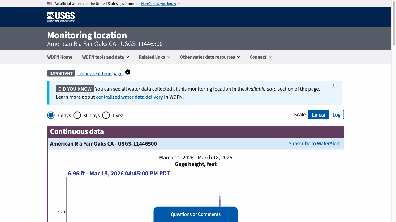
Custom Home Assistant sensors pull data from multiple sources on a schedule. The USGS REST API provides real-time river gauge readings for the American River at Fair Oaks, the key measurement for Lake Natoma paddling conditions. Weather data comes from local station APIs. Air quality data comes from AirNow’s API.
Each sensor normalizes its data into a consistent format. River levels are stored in cubic feet per second (CFS) and feet. Wind speed is in miles per hour. Air quality uses the AQI scale. The normalization happens in Home Assistant so the frontend does not need to understand multiple data formats.
The Data Pipeline
Home Assistant sensors update on different schedules. River levels change slowly (hourly updates are fine). Wind can change quickly (15-minute updates). Air quality data updates roughly hourly from the monitoring stations.
A Python script running on the Home Assistant instance pushes the latest sensor readings to the frontend on a schedule. The data is structured as JSON with timestamps so the frontend can show both current conditions and recent trends.
This is where Home Assistant’s API shines. Every sensor reading is available through the REST API with history. I can pull the last 24 hours of river levels to generate trend charts, or the last week of air quality data to show patterns. The Home Assistant API provides historical sensor data that is complex to build from scratch.
The Frontend: Astro with Islands

The PaddleConditions frontend is built with Astro. Most of the page is static content: explanations of what different river levels mean for paddling, safety information, location details for put-in points along the American River. This static content gets pre-built at deploy time and loads instantly.
The dynamic parts (current conditions, charts, last-updated timestamps) use Astro’s island architecture. Small interactive components hydrate only where needed. The current conditions widget is a React island that fetches the latest data and renders color-coded status indicators. The trend charts are another island. Everything else is static HTML.
I chose this approach over a full single-page application because paddlers check this site on their phones in parking lots with spotty cell service. A mostly-static page with small dynamic islands loads much faster than a JavaScript-heavy SPA. The site loads in under a second on mobile, which is the only metric that matters for this use case. This is the same performance-first approach I use across all my Sacramento web development projects, from the SacGroceries price comparison tool to e-commerce sites for local businesses.
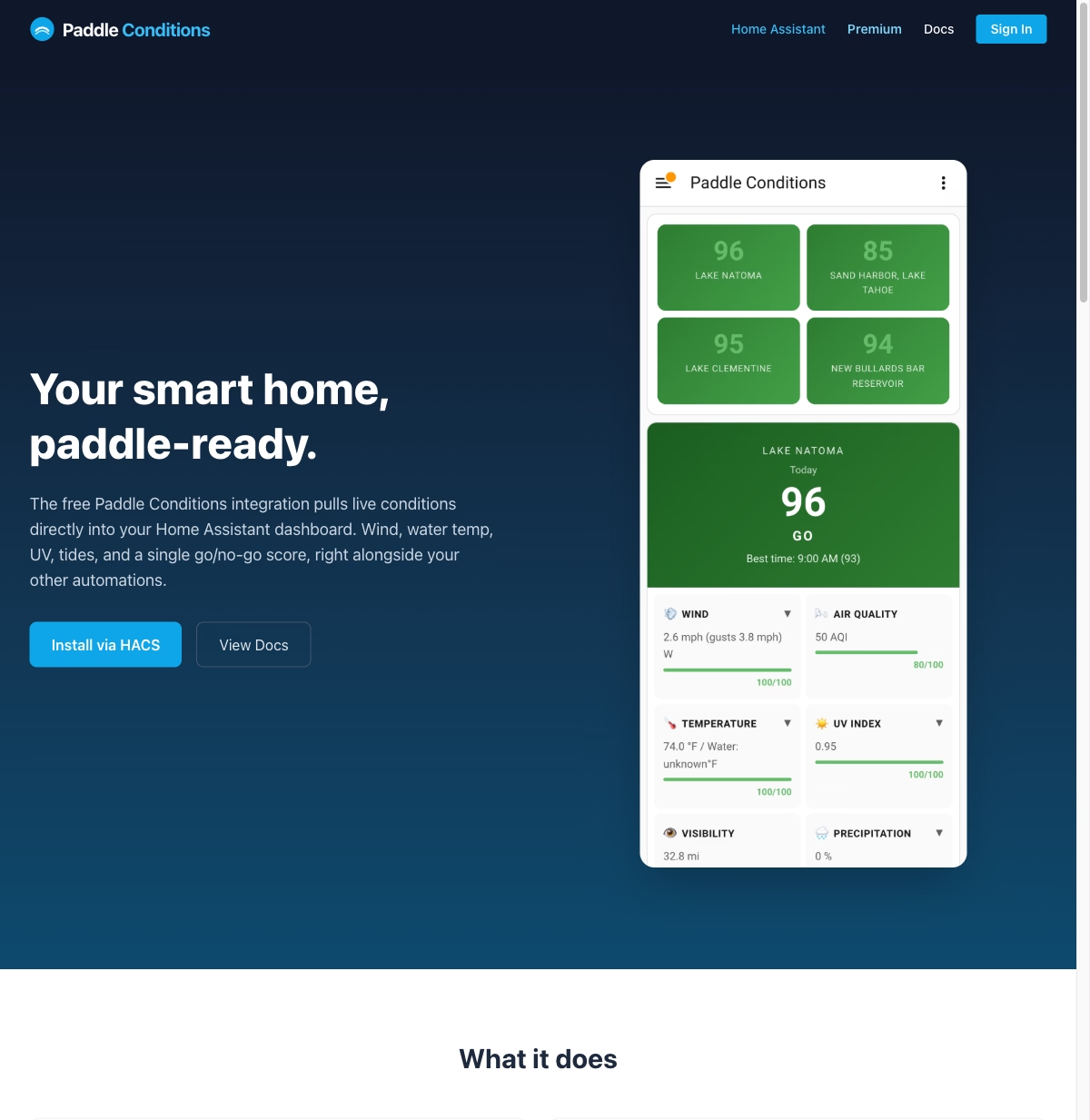
What the Color Codes Mean
The dashboard shows green, yellow, and red indicators for each condition. These are not arbitrary. Green means ideal conditions for recreational paddling. Yellow means conditions are acceptable but with caveats (higher flow, moderate wind, or marginal air quality). Red means conditions are unsuitable or potentially unsafe.
The thresholds are calibrated for Sacramento paddling specifically. River flow between 1,500 and 3,500 CFS is green for Lake Natoma flatwater paddling. Above 5,000 CFS is red because the current gets strong enough to be dangerous for casual paddlers. Wind above 15 mph is yellow because it makes SUP difficult. Above 25 mph is red.
These thresholds came from a year of paddling and checking conditions. They are opinionated, and experienced paddlers will disagree with some of them. But they give newcomers a quick, reliable read on whether it is a good day to get on the water.
Open Source and Real Users
PaddleConditions is open source on GitHub. The Sacramento paddling community uses it, which means I hear about issues quickly. Someone noticed the wind data lagging and I traced it to a sensor update timing issue. Another user suggested adding sunset time so paddlers know how much daylight they have. Real users make the tool better.
The Full Stack
From bottom to top: Home Assistant on a Raspberry Pi collects sensor data from USGS, weather, and air quality APIs. Python scripts normalize and push data. An Astro frontend with React islands renders the dashboard. The site deploys as static HTML with small dynamic components. Total infrastructure cost is negligible because the compute happens on a Raspberry Pi I already own.
This project ties together two things I care about: building useful web applications and paddling on the American River. If you paddle in Sacramento, check out PaddleConditions.com. And if you want to see the technical details, the project page has the full breakdown. PaddleConditions is part of a growing Sacramento tech scene where developers are building tools that serve the local community directly.